visual identity

visual identity

Delivering a revitalised brand identity for Canon Europe, Middle East and Africa.

Overview

01

Brief

Support the delivery and design of a “master brand” which will be activated across 52+ regions.  Company wide adoption was a hard requirement, failure was not an option.

02

Role

As senior design lead for all creative workstreams, I supported creative development, strategic brand planning, rollout, governance and overall creative sign off alongside the brand management team.

03

Outcome

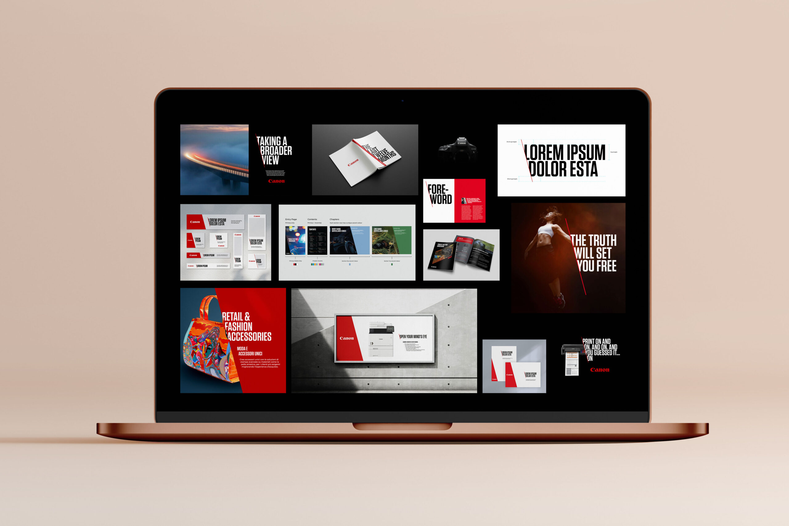
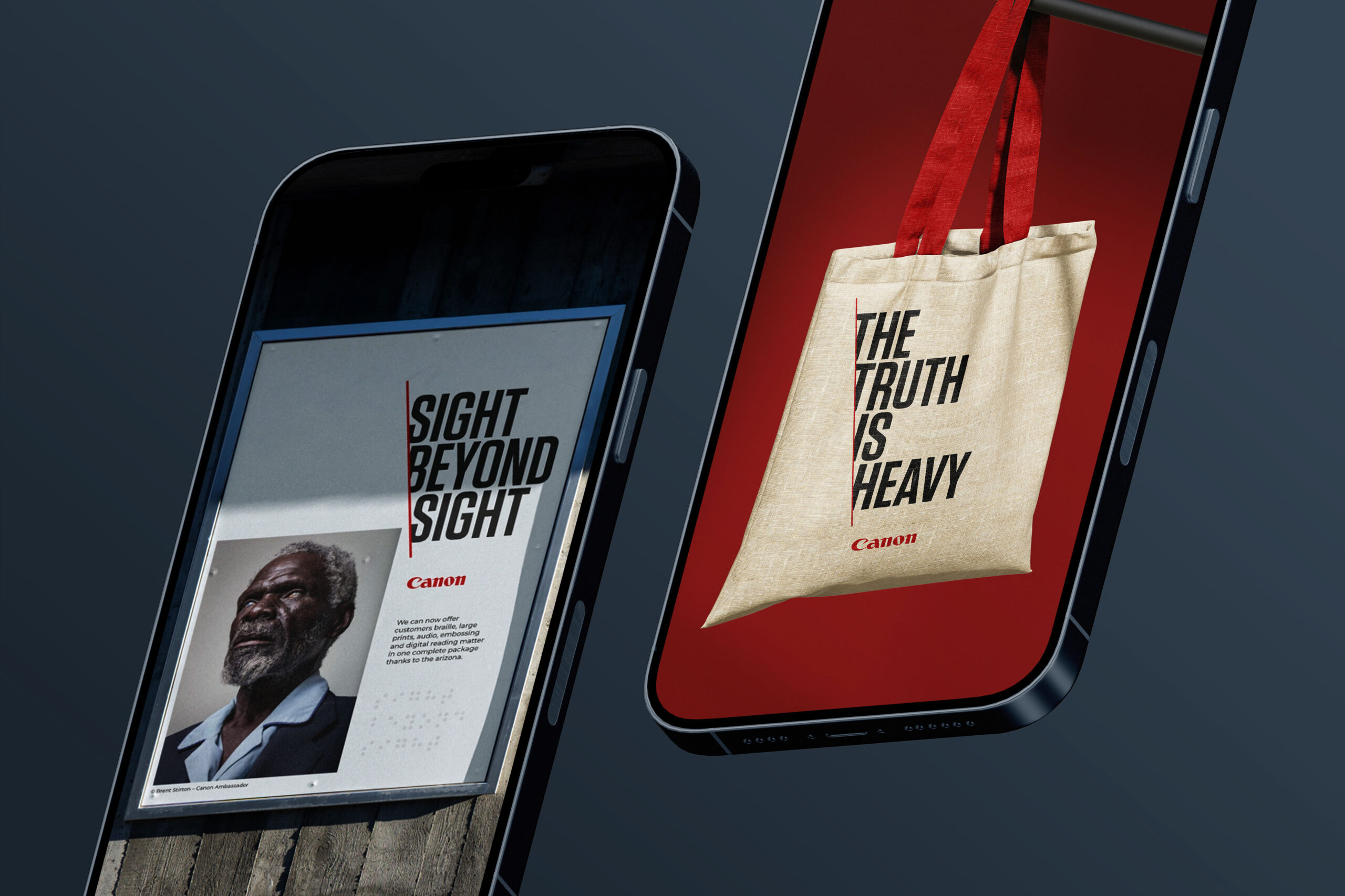
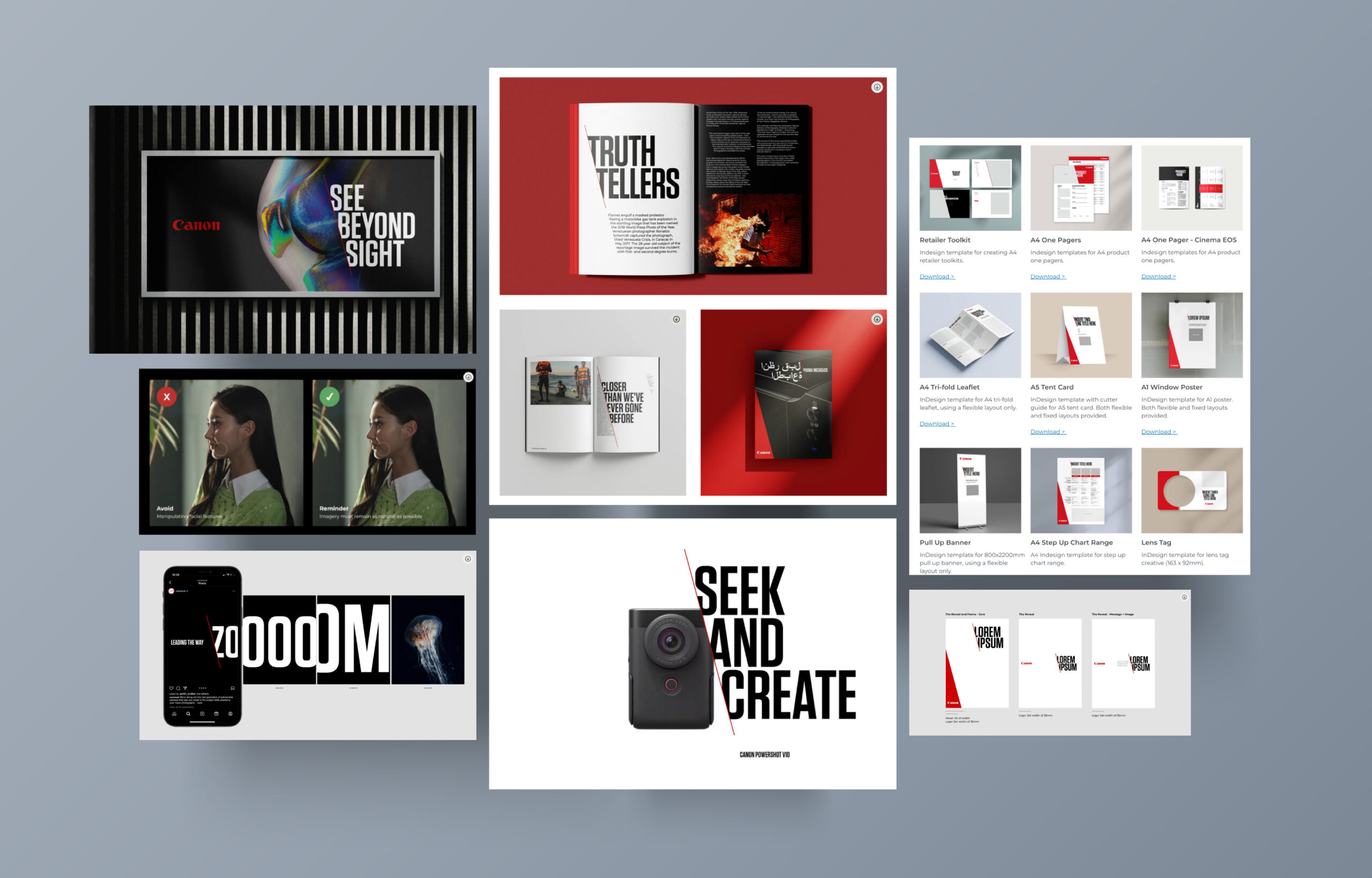
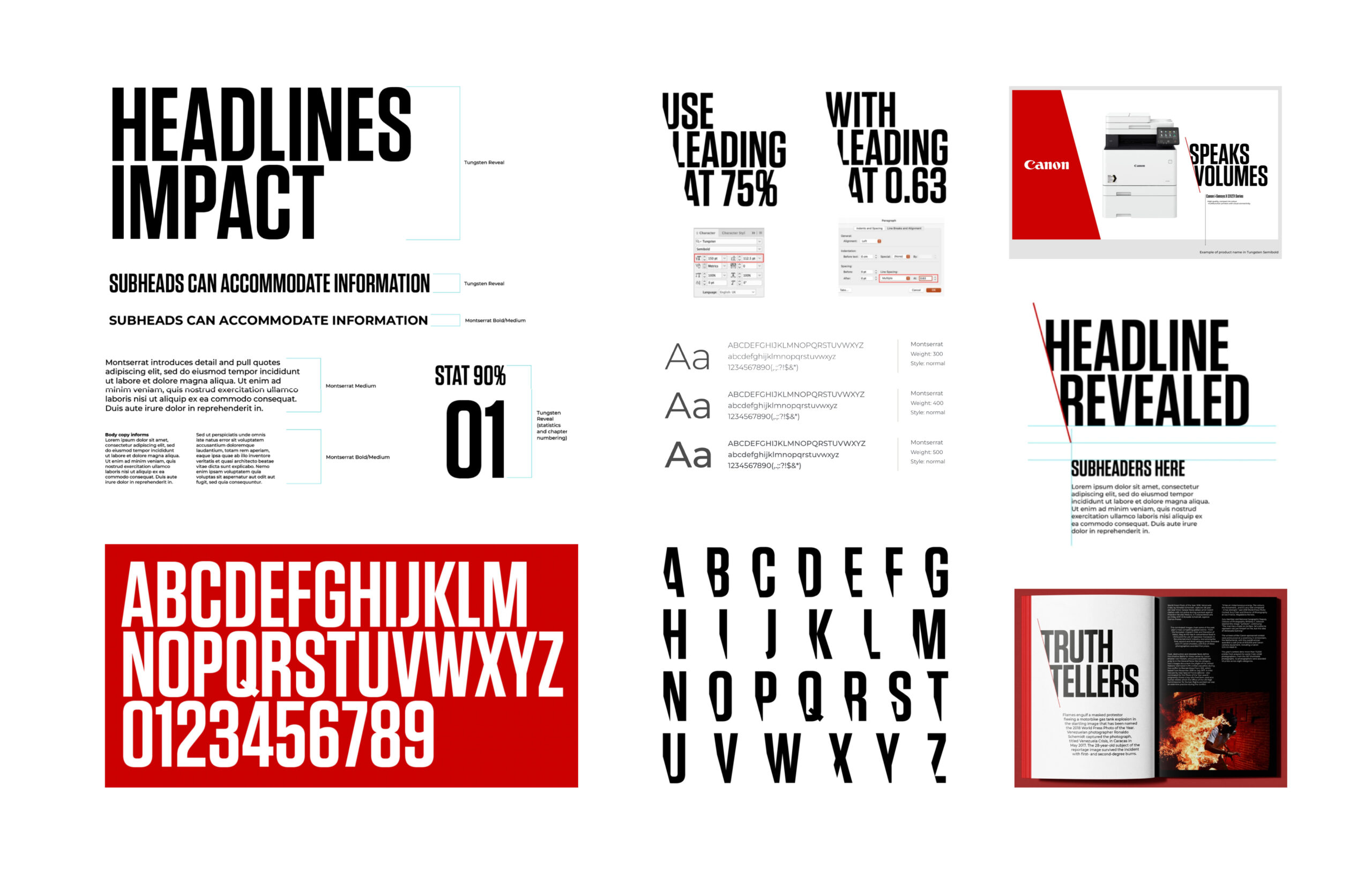
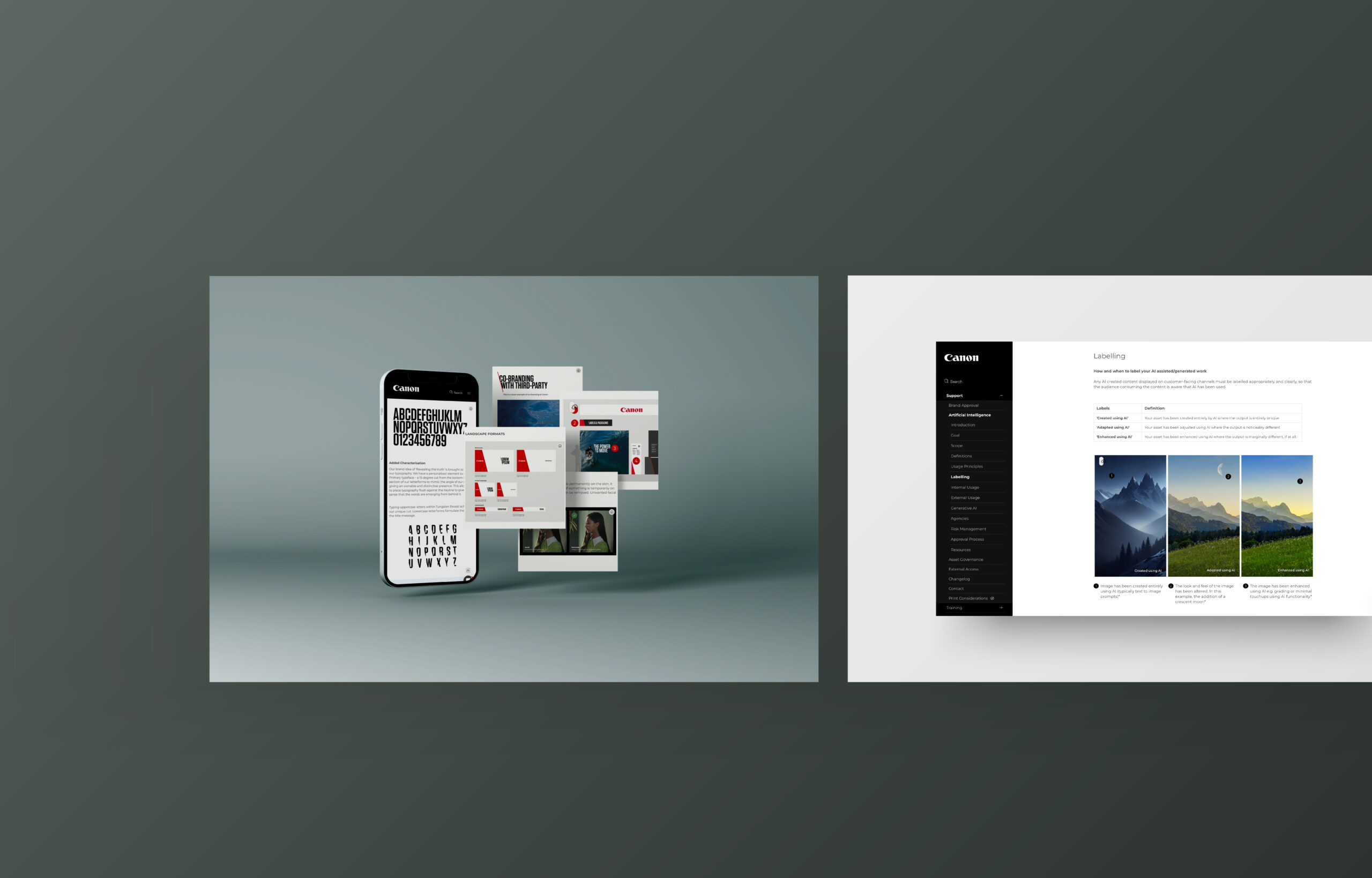
After a lot of collaborative work, strategic planning and bold design, we were able to successfully rollout a refreshed visual identity to the entire business, including group companies, affiliates, partners, retailers and external creative agencies alike whom all utilised the Canon brand daily to produce marketing collateral.

Discovery was an absolutely crucial phase that helped evaluate the needs and wants of a new and functional visual identity that works across 52+ regions. Early stage concepts were created to help aid discussion and fine-tune the overall visual identity goal and sell into the business, cultivating core strategic buy-in.

An entire eco-system was created to ensure stable and consistent reproduction of the visual identity across varying mediums. 

Exploration around key visual elements were derived from the master logo, and thus fourth the slanted keyline was created which now acts as the key visual identifier seen across the entire business.

Adaptable typographic hierarchy was developed that correctly reflects the brands tone of voice, ensuring legibility and flexibility across digital and print formats, including localised languages alike.

Establishing a suite of icons was required as part of the wider graphical language within the visual identity, and helped prevent rogue icons being created. Anything bespoke had to be reviewed by the brand approval process.

Clear photography and film direction guidelines were created to ensure consistency of production across entire business including any external creative agencies. These would include guidance around style, composition, mood, colour grading and more. 

Illustration principles were also developed shortly after the initial launch of the visual identity, these principles helped shape a definitive look and feel for illustration at the company. Modular templates were also created to reduce inconsistencies in design. 

Conceptual designs that showcase how varying mediums are impacted to provoke meaning and core messaging. In this example, it’s focusing purely around merchandise where the red keyline is utilised in a physical format.

Let’s Talk
Let’s Talk
I'm available to take on new projects. Let's discuss your ideas and bring them to life!